2026-03-09
The Oblique Effect
v2.2.0 release notes →Look at a toolbar in your peripheral vision. You can tell there are four buttons separated by dividers. You can’t tell which icon is which. The button rectangles and divider lines are horizontal and vertical. The icons inside — check marks, close ×, navigation chevrons — are built from 45° strokes.
NNg’s research on icon usability (Harley 2014) found that icons without text labels are functionally invisible — “obscure icon = wasted feature.” The oblique effect offers a perceptual mechanism for part of that failure. V1 responds more strongly to cardinal orientations (Furmanski & Engel 2000), and web layout is overwhelmingly cardinal — text baselines, column borders, horizontal rules, input field edges — giving it a biological advantage that diagonal icon strokes do not.
Can you see the error from here?
LukeW’s inline validation study (2009) found that showing errors as users fill in fields — rather than after submission — improved success rates by 22% and reduced completion time by 42%. The eye-tracking data is the telling number: 47% fewer fixations. The study didn’t test peripheral detection directly, but the geometry fits: red borders are high-contrast cardinal signals that the periphery is tuned to detect.
The oblique effect accounts for the geometry component of those red borders — cardinal edges survive further than oblique ones at the same eccentricity.
A designer can’t assume the error message text is readable at 8° eccentricity, but the shape of the error state — colored rectangle with H/V borders — persists further. Inline validation works for many reasons: immediate feedback, reduced memory load, temporal proximity. The oblique effect adds one more — it relies on a signal structure the periphery is tuned to detect.
What v2.2 changes
Until v2.2, Scrutinizer treated all orientations equally — a horizontal text baseline lost fidelity at the same eccentricity as a diagonal noise texture. v2.2 adds orientation-selective attenuation: cardinal edges keep more detail further into the periphery.
What the shader sees
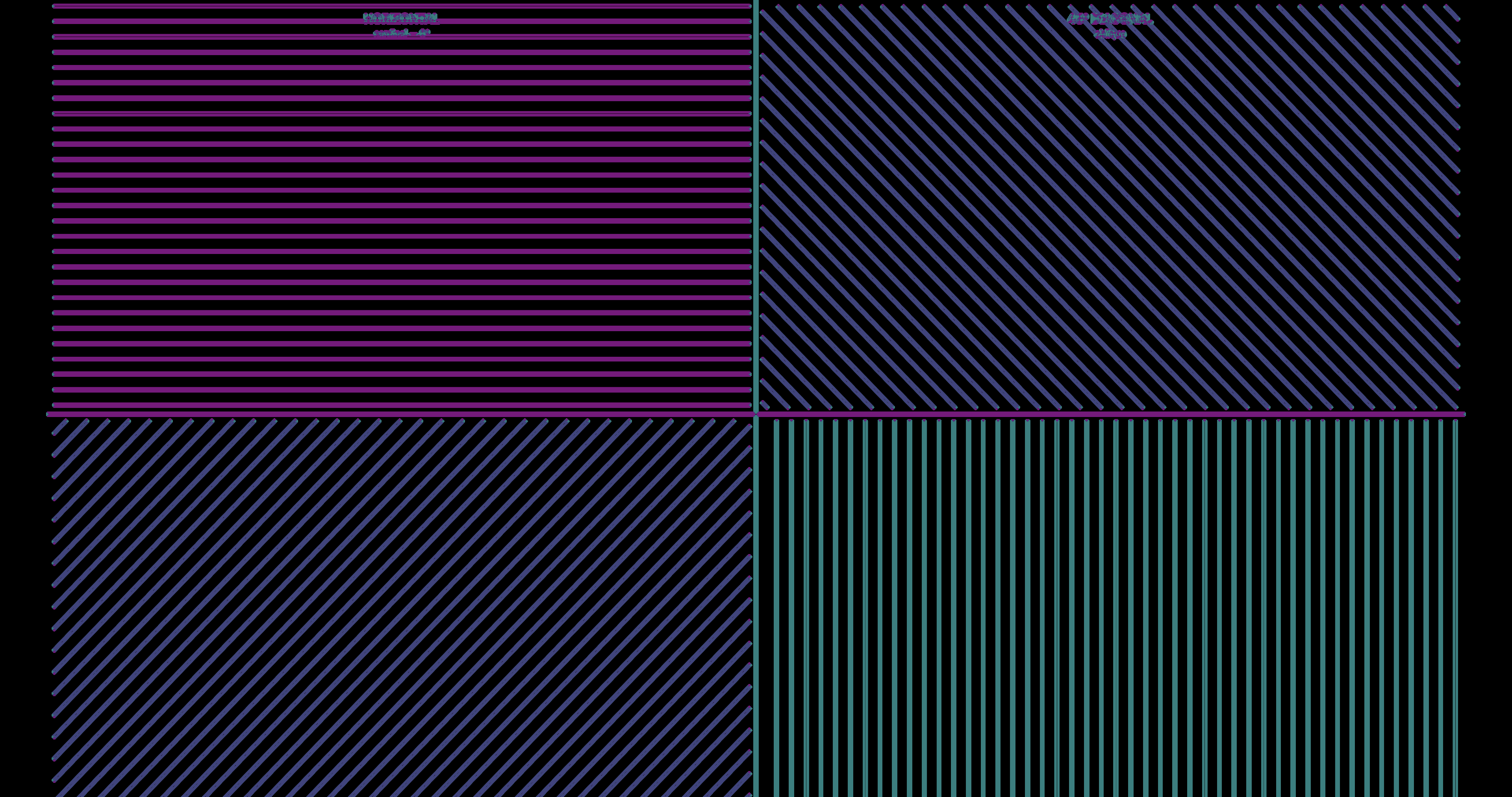
Every pixel gets decomposed into four orientation channels, matching V1 simple cell tuning (Hubel & Wiesel 1962). Here’s a test pattern with horizontal lines (top-left), vertical lines (bottom-right), and 45°/135° diagonals (top-right, bottom-left):
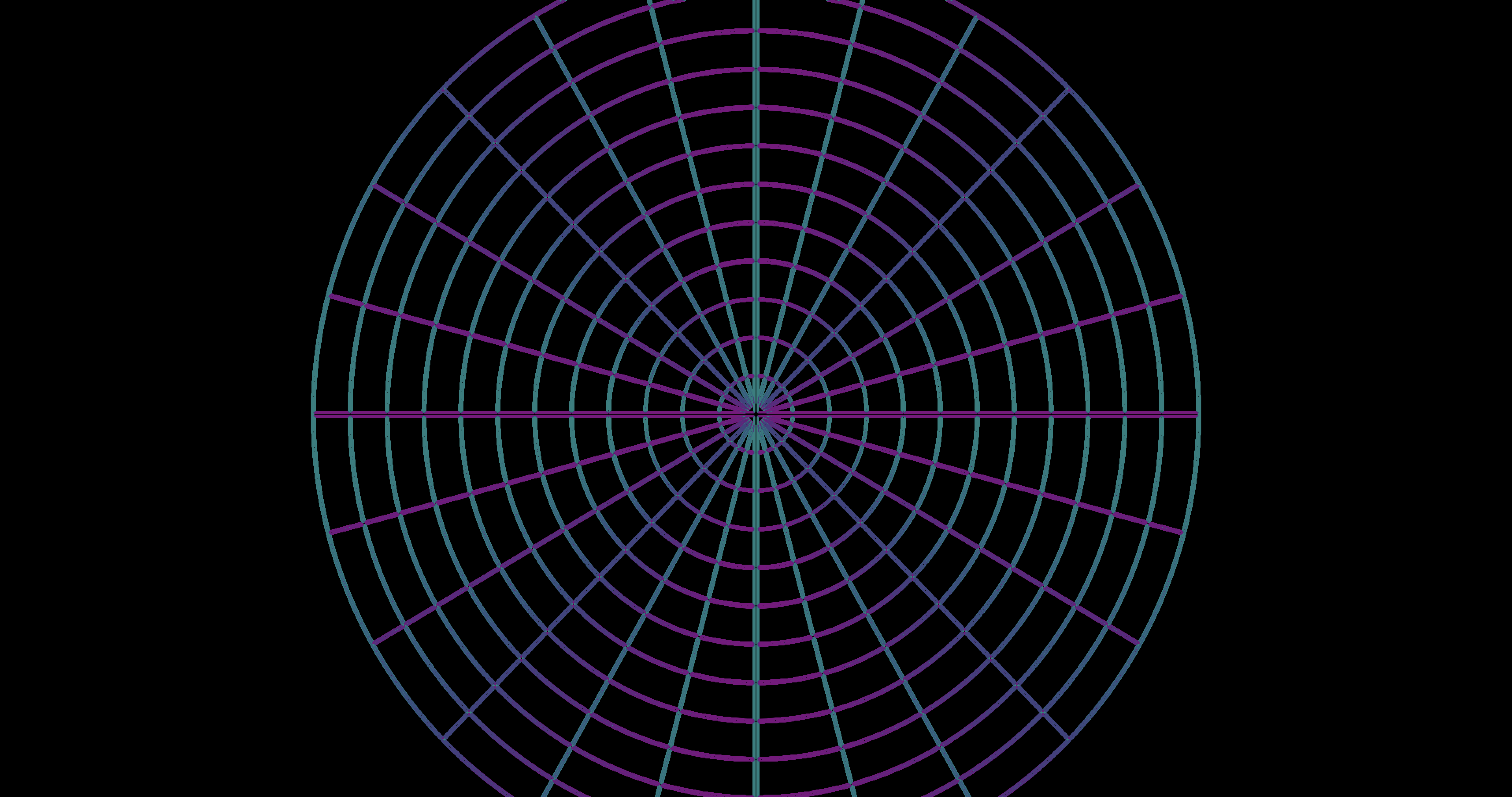
The same decomposition on a spider web, where orientation varies continuously:
Four layers of biology
The implementation models four layers:
- The oblique effect itself (Appelle 1972) — fine features like serifs and thin strokes get up to 50% more peripheral reach; coarse layout blocks get 10%.
- 4-channel V1 simple cell decomposition — separate energy channels for horizontal, vertical, 45°, and 135° (Hubel & Wiesel 1962) replace a single cardinal-vs-oblique score.
- Radial-tangential crowding — peripheral vision smears features along the line toward fixation (the radial axis), so two letters stacked radially interfere more than two letters side-by-side (tangentially). The crowding zone is an ellipse elongated radially (Toet & Levi 1992).
- Eccentricity-dependent fade — the cardinal advantage isn’t uniform. Fine spatial frequencies lose it by 8–18° (Berkley et al. 1975); coarse frequencies retain it further into the periphery.
Why the effect is subtle
The oblique effect is a detection threshold phenomenon — 30–50% better acuity at the threshold of visibility. At the suprathreshold contrasts of typical web content (black text on white, colored buttons), the orient bonus extends band cutoffs by a fraction that gets further compressed by the downstream pipeline: fovea/periphery blending, luminance contrast normalization, chromatic aberration, and Oklab chromatic pooling. The result is biologically correct but visually subtle. You won’t see a dramatic before/after in a screenshot. You might notice it the way you notice the real thing — toolbar structure holds together a beat longer than icon detail, and you don’t think about why.
The full implementation detail — shader math, per-band fade curves, uniform reference, and performance budget — is in the v2.2.0 release notes and the oriented DoG spec.
Literature: Appelle 1972 · Barbot, Xue & Carrasco 2021 · Berkley, Kitterle & Watkins 1975 · Campbell, Kulikowski & Levinson 1966 · Furmanski & Engel 2000 · Hubel & Wiesel 1962 · Toet & Levi 1992
Design references: Wroblewski 2009, Inline Validation in Web Forms · Krause 2019, 10 Design Guidelines for Reporting Errors in Forms · Harley 2014, Icon Usability
Specs: Full spec · Validation spec
Also in this release
- Static page optimization — a fast pixel-sample checksum gates worker submissions. On a static page, both saliency and congestion workers drop to zero compute after initial analysis settles. How the dirty check works →
- Congestion-gated pooling on by default — enabled in all research modes with verified zero perf regression at maximum resolution.
- Degradation Strength menu — the peripheral intensity scale is now anchored on “Reference” (best simulation fidelity) instead of arbitrary percentages. Labels communicate deviation from the reference: Reduced < Reference < Amplified < Maximum.
- Performance HUD — live FPS, frame timing (avg/p95/max), and per-phase breakdown in the ComplexityHUD Perf tab. FrameTimer architecture →
- Pipeline architecture doc — comprehensive spec covering the five performance gates, worker data flow, smoothing countdowns, and texture slot management. Full spec →
Testing the math
v2.2 also adds 23 regression tests encoding findings from the five-wave
psychophysical validation. The tests mirror the core attenuation and
crowding formulas, load parameters from modes.json, and
validate against published data (Bowers 2025, Mullen & Kingdom 2002).
If a parameter drifts, these catch it before the next data collection.