2026-03-04
Color Persists in the Periphery: Even Where You're Not Looking
v1.9.0 release notes →For twenty years, the standard shorthand for peripheral color has been “desaturation” — color drains away uniformly with eccentricity. This framing comes from a specific historical moment: threshold studies measured the minimum detectable chromatic contrast at increasing eccentricities and found it rising steeply, especially for red-green. The conclusion hardened into conventional wisdom. Peripheral vision is achromatic. Color is foveal.
The problem is that those studies measured detection, not appearance. Web colors aren’t hovering at threshold — they’re saturated reds, blues, and greens well above any detection limit. And the more recent literature paints a different picture. Jiang, Shooner & Mullen (2022) showed that perceived contrast follows a compressive power law — peripheral color appearance holds up much better than threshold sensitivity would predict. Tyler (2015) demonstrated that eccentricity-scaled stimuli appear vivid out to large eccentricities. Rosenholtz’s Texture Tiling Model frames peripheral color not as lost but as pooled — averaged over progressively larger regions, preserving mean chromaticity while losing spatial chromatic detail.
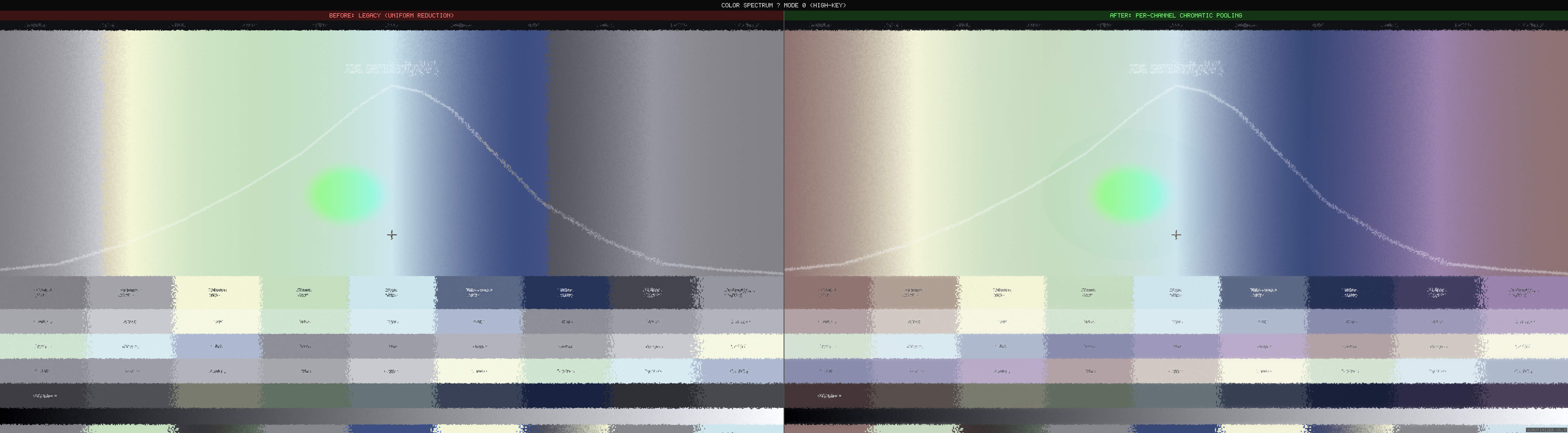
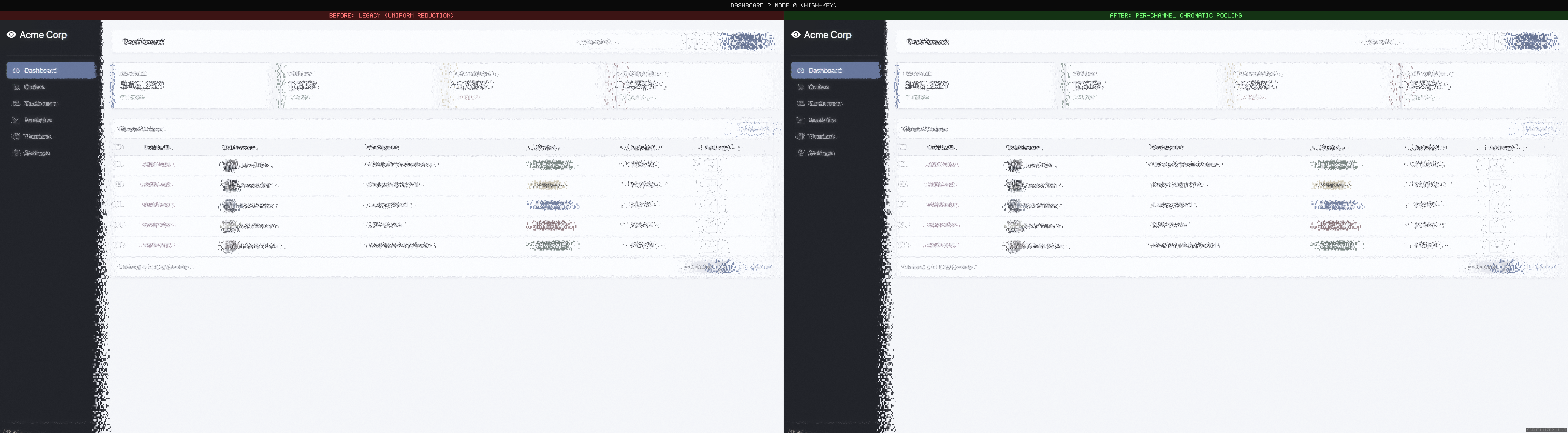
This release replaces Scrutinizer’s uniform chrominance reduction with a pipeline grounded in the current understanding. The result is visible immediately.
For practitioners: this is the biological mechanism behind WCAG 1.4.1 (Use of Color). The guideline says don’t rely on color alone — the periphery shows why. Red-green distinctions that are obvious at fixation become ambiguous a few degrees away. But color itself persists: make colored regions large enough, and they remain visible far into the periphery.
Before and after
What changed in the pipeline
Two biological asymmetries that uniform desaturation misses entirely:
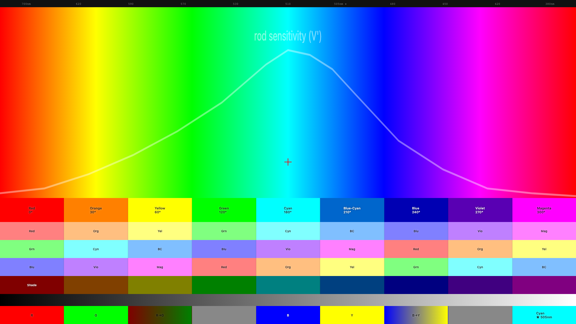
Channel-dependent decay rates
Red-green color sensitivity is a foveal specialization. The wiring that lets you distinguish red from green depends on one-to-one connections between photoreceptors and brain cells — connections that only exist near the center of gaze. As you move into the periphery, those connections pool together and the red-green signal collapses. Half the sensitivity is gone by about 5° from center.
Blue-yellow is different. The wiring for blue-yellow covers the entire retina — it’s ancient neural circuitry, far older than the red-green specialization. Half the sensitivity isn’t lost until about 26°. That’s roughly a 5:1 difference in how fast these two color channels fall off. Treating both channels identically — the old approach — over-attenuates blue-yellow by an order of magnitude.
Size-dependent preservation
Bigger color areas survive further into the periphery. A full-width colored banner retains its color identity much further than 14px colored text (Abramov, Gordon & Chan 1991). The visual system pools color over progressively larger regions — large patches average to a consistent hue, while small colored details get swallowed.
Scrutinizer’s pipeline already separates content by spatial scale (fine detail vs. large regions). Applying different color decay rates at each scale gives size-dependent preservation automatically — no need to measure stimulus size explicitly. The design takeaway: if you rely on color coding for peripheral discoverability, make the colored regions large.
| Channel | 50% sensitivity | What this means for design |
|---|---|---|
| Red-green | ~5° from fixation | Red/green distinctions only work near where the user is looking |
| Blue-yellow | ~26° from fixation | Blue UI elements remain visible across most of the screen |
| Brightness | ~7° from fixation | Light/dark contrast is the most reliable peripheral signal |
Standard UX guidance says don’t rely on color alone (Gordon, NNg 2021) — pair it with icons, labels, or shape. That advice is correct but incomplete. It treats all hues as equivalent, as though a red badge and a blue sidebar face the same peripheral fate. They do not. A red error dot in a nav bar sits roughly 10–15° from typical reading fixation — well past the 5° half-sensitivity point for red-green. At that eccentricity the dot has lost most of its chromatic identity and survives only on luminance contrast. A blue sidebar at the same eccentricity retains its hue, because 10° is still inside the blue-yellow channel’s comfort zone. The practical upshot: when choosing which color carries meaning in the periphery, blue and yellow outlast red and green by a wide margin.
Colors that are well above the detection threshold — like the saturated reds and blues on most websites — hold up better in the periphery than threshold studies predicted (Jiang, Shooner & Mullen 2022). The shader applies a correction for this so web-scale colors don’t vanish unrealistically fast.
Congestion-gated pooling (Mode 9)
Update (v2.2): This feature graduated from experimental to default. Congestion-gated pooling now runs in all research modes with zero measurable frame-time cost on static pages. v2.2 release post →
Rosenholtz et al. (2012) argue that peripheral vision computes summary statistics over local pooling regions, and that clutter is what happens when those statistics are ambiguous — too many features packed into a pooling region makes the summary unreliable. Mode 9 tests this prediction directly: the shader reads the congestion map and multiplies peripheral pooling strength by local clutter.
// peripheral2.frag
float congestionBoost = 1.0 + lgn.congestion * 1.0;  // 1.0x – 2.0x
coupledEccentricity *= congestionBoost;
Dense text columns and image-heavy sidebars pool more aggressively in the periphery than clean whitespace. The congestion worker auto-starts on mode selection and recomputes on scroll and navigation.
Tagged experimental. The 1.0× multiplier and linear boost curve are initial
estimates. The prediction is testable: show observers gated vs. ungated peripheral renderings
alongside gaze-contingent photographs and measure which simulation looks more realistic.
Crowding: the gap we can see
Two new reference pages expose a fundamental limitation. crowding.html places
a target letter flanked by random letters (crowded) next to an identical letter in isolation,
both at the same eccentricity. In real peripheral vision, the isolated letter is identifiable
while the crowded letter is not — even when both are above acuity threshold.
In Scrutinizer, both letters are equally degraded. The V1 displacement field is computed from pixel position only — it has no knowledge of what is adjacent. An isolated letter and a densely flanked letter at the same eccentricity receive identical distortion.
Bouma’s law predicts critical spacing of ~0.4–0.5× eccentricity (Bouma spacing reference). Flankers within this radius contaminate the target’s pooling region; flankers outside it leave the target intact. Implementing this requires feeding the structure map’s density channel into V1 strength — a sigmoid gate where dense content gets full displacement and isolated elements are spared. The spec is written (density_gated_crowding.md), the reference pages are published, and the gap is documented.
Also in this release
- Saliency vs congestion split view — side-by-side heatmap rendering. Left: saliency (indigo-to-white, “what pops out?”). Right: congestion (blue-yellow-red, “how cluttered?”). Menu: Simulation → Utility → Congestion Report.
- scrutinizer-audit CLI + MCP server — headless analysis pipeline
(Playwright) reusing the same congestion scoring as the ComplexityHUD.
node cli/scrutinizer-audit.js https://example.com --fail-above 60for CI gates. Three MCP tools (analyze_url,analyze_urls,compare_pages) for AI-assisted design review. - Suprathreshold correction — the research measures the faintest detectable color at each distance. Web colors are far stronger than that. The shader now corrects for this so peripheral color doesn’t vanish unrealistically fast.
- Red Kill Switch guard — fixed a bug where legacy color code was double-attenuating red when the new chromatic pipeline was active.
- Saccadic blindness — foveal and parafoveal regions shrink proportionally to mouse velocity, simulating saccadic suppression. At fast flick speeds the entire viewport renders as periphery. Menu toggle, off by default.
- Mode 8 (Gaussian Desaturation) removed — superseded by per-channel chromatic pooling. Recent data (Bowers et al. 2025) showed the old decay curve was the wrong shape for red-green. Gaussian color decay remains in Mode 6 for comparison.
- Doc terminology scrub — replaced “desaturation” with “chromatic pooling” / “chrominance reduction” across 8 docs where describing biology. Peripheral color is pooled, not lost.
What’s next
- Density-gated crowding — sigmoid density gate on V1 strength so dense content gets full displacement while isolated elements are spared. Spec: density_gated_crowding.md Shipped in v2.0
- Oriented DoG bands (Oblique Effect) — cardinal edges persist ~50% further
than oblique ones. Spec:
oriented_dog_bands.mdShipped in v2.2 - Suprathreshold calibration — pin down the power-law exponent against gaze-contingent ground truth. Current 0.5 is conservative; literature mean is ~0.63.
Links: GitHub · Changelog · Full release notes · Chromatic pooling spec
References: Ashraf et al. 2024 (castleCSF) · Jiang, Shooner & Mullen 2022 · Abramov, Gordon & Chan 1991 · Bowers, Gegenfurtner & Goettker 2025 · Rosenholtz et al. 2012 (TTM) · Mullen & Kingdom 2002 · Tyler 2015 · Gordon 2021 (NNg) — Annotated Bibliography · Primer References