2026-03-03
Scrutinizer v1.8: Scientific Accuracy Audit & Feature Congestion
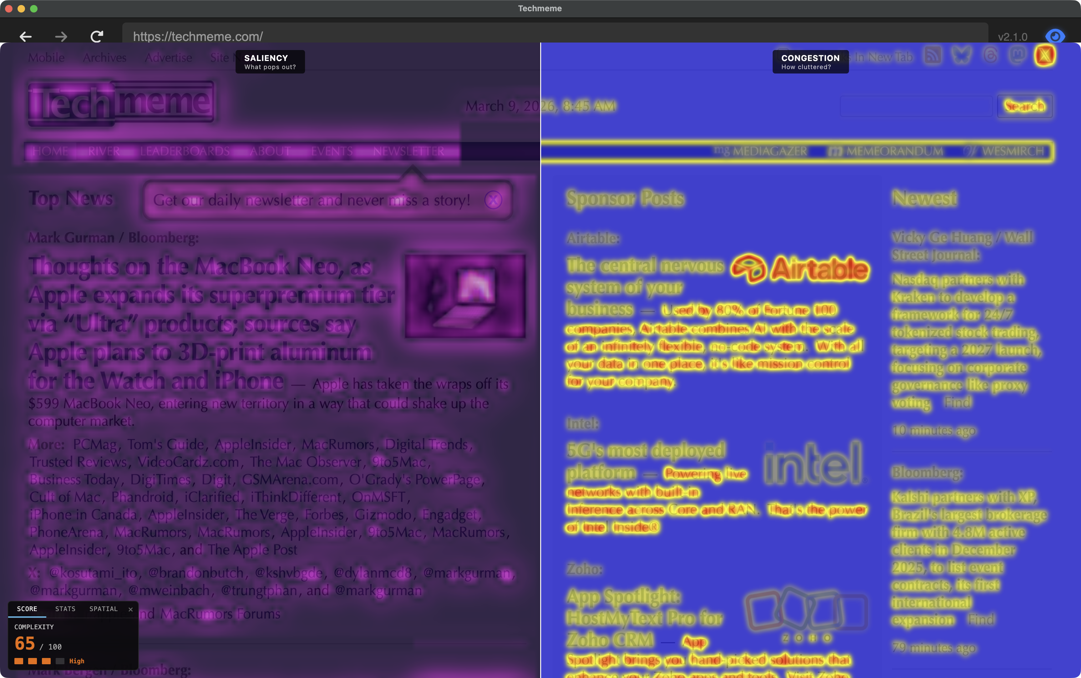
v1.8.0 release notes →Two themes in this release. First, a scientific accuracy audit — replacing geometric cutoffs with linear M-scaling and recalibrating E2, the distance from fixation where spatial resolution drops to half its foveal value. Second, a new analytical tool: Feature Congestion (Rosenholtz et al. 2007) ships as a real-time visual clutter metric with an interactive HUD overlay.
Linear M-scaling
The v1.6 DoG band cutoffs used a geometric 2× series (0.3, 0.6, 1.2, 2.4 × E2), which over-predicts resolution loss near fixation. Biological M-scaling predicts linear growth of minimum resolvable detail with eccentricity:
— Rovamo & Virsu (1979). Band $k$ (spatial scale $2^k$ px) drops out when $s_{\min}(e) > 2^k$, giving cutoff eccentricity $= E_2 \times (2^k - 1)$:
| Band | Spatial Scale | Cutoff (× E2) | Content |
|---|---|---|---|
| band 0 | 1–2 px | 1 | Serifs, hairlines |
| band 1 | 2–4 px | 3 | Letter bodies, small icons |
| band 2 | 4–8 px | 7 | Words, UI elements |
| band 3 | 8–16 px | 15 | Buttons, layout blocks |
| residual | 16 px+ | Always | Overall color/luminance |
The perceptual effect: coarse structure (bands 2–3) now persists further into the periphery — you see where a button is but can’t read its label. Fine detail (band 0) drops at the same rate as before. This is the mechanism behind the F-shaped reading pattern (Nielsen 2006; Pernice 2017): fine text detail requires foveal fixation, but coarse layout structure (headings, indentation, spacing) is available parafoveally, so users scan the left edge for structure without fixating every line. E2 values were recalibrated to preserve the band-0 onset point under the new formula: 0.15 (High-Key), 0.12 (Biological).
Two additional correctness fixes. Hardware MIP levels use box/bilinear downsampling, not Gaussian convolution — every doc, shader comment, and paper reference that said “Laplacian pyramid” now says approximate Laplacian pyramid and notes the distinction from Burt & Adelson (1983). And final color output is clamped to [0,1] to prevent negative-going band artifacts from the DoG subtraction reaching the framebuffer.
Feature Congestion
Feature Congestion (Rosenholtz, Li & Nakano 2007) measures visual clutter as local feature variance across color channels. Where saliency answers “what pops out?” (center-surround contrast, relative), congestion answers “how much is going on?” (local variance, absolute). A dense product grid with nothing that particularly pops out still scores high on congestion.
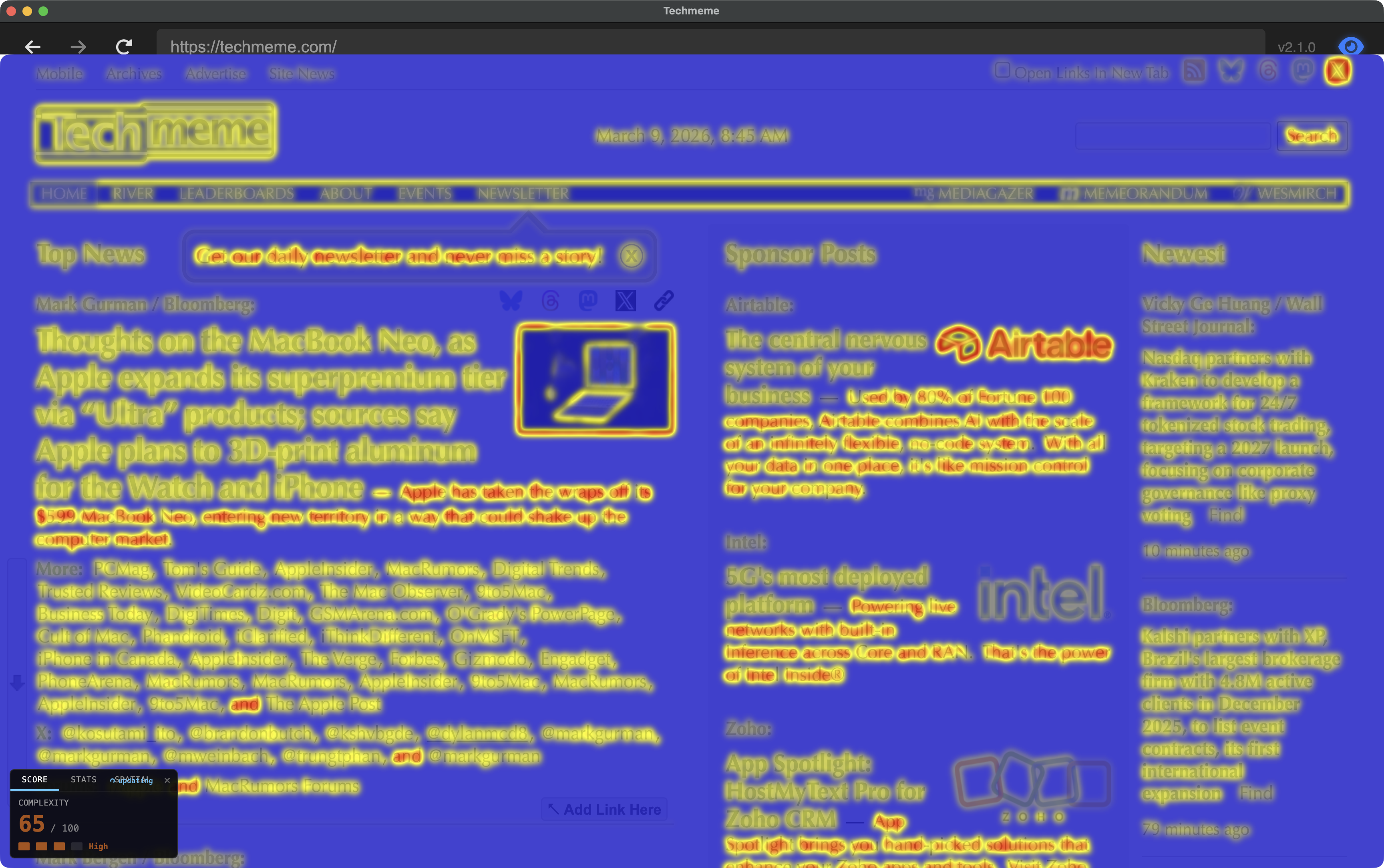
The key finding during implementation: fixed σ=2.5. Auto-scaling σ with resolution — standard for natural images — fails on web content because pages at different resolutions are the same layout at different pixel densities, not the same scene at different zoom levels. Scaling σ up smears text, borders, and UI into indistinguishable blobs. Fixed σ keeps the neighborhood matched to the feature scale that matters.
| Resolution | Auto σ | ρ | Fixed σ=2.5 | ρ |
|---|---|---|---|---|
| 512 px | 5.0 | 0.53 FAIL | 2.5 | 0.89 |
| 768 px | 7.5 | 0.60 FAIL | 2.5 | 0.93 |
| 1024 px | 10.0 | 0.65 FAIL | 2.5 | 0.92 |
Two Web Workers handle analysis: saliency (256 px, every 15th frame, continuous) and congestion (1024 px, on-demand when the HUD is toggled). The saliency map texture is now RGB-packed: R=saliency, G=congestion, B=edge density. Scoring formula:
P90 captures the busy regions, ignores whitespace. Sqrt scaling spreads the [0,1] raw range into a discriminative [0,100] score. Validated at Spearman ρ=0.93 against Rosenholtz’s reference implementation. The full algorithm story — the fixed-σ discovery, validation pipeline, and scoring design — is in the congestion tech brief.
If you work in UX research, congestion maps where information foraging (Pirolli & Card 1999) breaks down at the pre-attentive level. When local feature variance is high, your peripheral vision can’t efficiently sample the page for navigation cues — the “information scent” that guides scanning degrades before it reaches conscious processing. A high congestion score predicts that users will need more fixations to orient themselves.
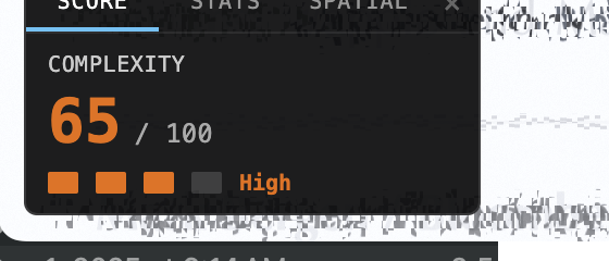
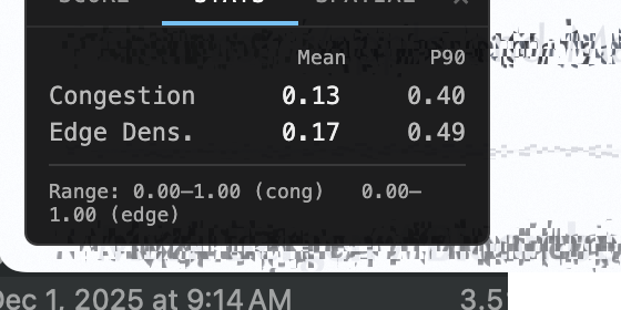
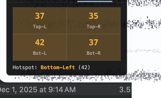
ComplexityHUD
Interactive draggable overlay replacing the toolbar URL-bar approach. Three tabs: Score (live congestion score with color-coded badge), Stats (p50/p75/p90 breakdowns for congestion and edge density), Spatial (quadrant breakdown identifying congestion hotspots). Scroll and navigation-aware — the heatmap hides immediately on scroll to prevent stale overlay, restores when fresh worker results arrive.
Mode 9: Congestion-Gated Pooling (Hypothesis)
Update (v2.2): Congestion-gated pooling shipped as the default in all research modes, with verified zero performance regression at maximum resolution. No longer a hypothesis — it’s how the pipeline works now. v2.2 release post →
A new mode wired in modes.json with category: “hypothesis”.
The shader reads u_congestionMap on TEXTURE4, but pooling modulation
is not yet implemented. The hypothesis: cluttered regions should get stronger peripheral
pooling — harder to resolve in the periphery when there’s more local feature
variance competing for the same summary-statistic representation.
This tests Rosenholtz’s (2012) prediction that visual clutter and crowding are
manifestations of the same computation. High-congestion areas would receive increased
MIP pooling, simulating the degraded feature access that occurs when peripheral receptive
fields pool over diverse, competing features. Tagged hypothesis to
distinguish from the validated modes (0–8).
What’s next
- Perceptive-field chromatic pooling — Abramov et al. (1991) showed that the perceptive field for color is larger than for luminance, and S-cone signals degrade faster with eccentricity. This would add chromatic-specific pooling radii to the DoG bands. Shipped in v1.9
- Oriented DoG bands (Oblique Effect) — Cardinal (H/V) edges get M-scaling cutoffs pushed ~50% further, modeling the 30–50% acuity advantage for horizontal and vertical edges over oblique ones (Appelle 1972). Shipped in v2.2
- Validation corpus expansion — Current corpus is 10 images. Expanding to 20+ for statistical confidence in the Spearman correlation. Shipped in v2.1
Links: GitHub · Changelog · Feature Congestion tech brief · Congestion journey (implementation log) · Pernice, “F-Shaped Pattern” (2017)