Apr 25, 2026 Tech Brief
The Color Design Insight We Don't Know We Know
Already in vision science. Already in AR. Coming to design.
Red means error, danger, urgency, destruction. Blue means information, default action, system state. The major design systems lean this way — Material, Carbon, Bootstrap. It's the dominant convention. The retina doesn't agree, at least not in the periphery, where most of a screen sits at any given fixation.
The understanding isn't new. The Impressionists were designing for the periphery in the 1880s; Mullen and Kingdom mapped the chromatic-channel asymmetry across the visual field in 2002; Margaret Livingstone carried the vision-and-art story to the HCI community in her UIST 2012 keynote; AR/VR rendering pipelines exploit the asymmetry for power savings today.
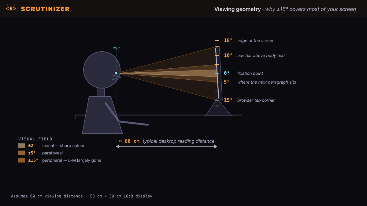
Quick orientation before we start: periphery here means everything beyond a few degrees of where your eye is currently pointing — at typical desktop viewing, most of your screen.
What the painters found — and what they couldn't
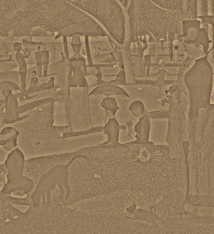
Painters worked this same edge for centuries, and Seurat is the cleanest case. In A Sunday on La Grande Jatte (1884), the chromatic mixing isn't done by the painter at all — it's done by your retina. Each dot is a single unmixed pigment. Stand close and the surface is visibly stippled; step back and each dot subtends a smaller visual angle, so the visual system integrates the marks into lawn, parasols, river. Away from fixation, peripheral pooling accelerates the same effect. The dots are the design; your visual system finishes the painting.
 Original
 High frequencies
 Low frequencies
That is the half the painters could reach by eye: the periphery discards fine spatial detail and pools what remains, so marks below the resolving scale merge into form. Sfumato's soft edges, Impressionist broken colour, Pointillist dots — the same discovery each time, that the visual system assembles an image the surface only suggests. It is the spatial-frequency story Rosenholtz's pooling models formalize and the one Livingstone carried to HCI, built on the Mona Lisa's low-spatial-frequency smile.
But spatial frequency is only half the story — and it's the half that hides the part this post is about. What no painter could isolate, because nothing in the practice would surface it, is that the periphery doesn't shed every colour at the same rate. One chromatic channel collapses fast; the other barely moves. That asymmetry never entered the art-historical account, and it is where the design consequences live.
The asymmetry
Color vision depends on two opponent channels. Red-green (L-M) opponency — the red-vs-green channel — is strongest in the central retina: its high-acuity form relies on midget ganglion cells wired near 1:1 to individual L and M cones, a circuit that degrades rapidly as retinal sampling becomes coarser. For small, low-spatial-frequency isoluminant gratings (the standard stimulus class in Mullen & Kingdom 2002), sensitivity falls steeply with eccentricity — down ~50% by 8–10° and substantially weakened by 20°. The exact loss depends on stimulus size, luminance contrast, and spatial frequency; weakened, not absent.
“Colors are only symbols. Reality is to be found in luminance alone.”
Blue-yellow (S-(L+M)) opponency has different hardware — including dedicated S-cone bipolar pathways — and remains measurable much farther into the visual field. S-cone sensitivity stays appreciable out to ~40–50° eccentricity. The ingredients of this pathway are evolutionarily ancient: short-wavelength-sensitive cones and comparisons against longer-wavelength signals long predate the recent primate L/M duplication.
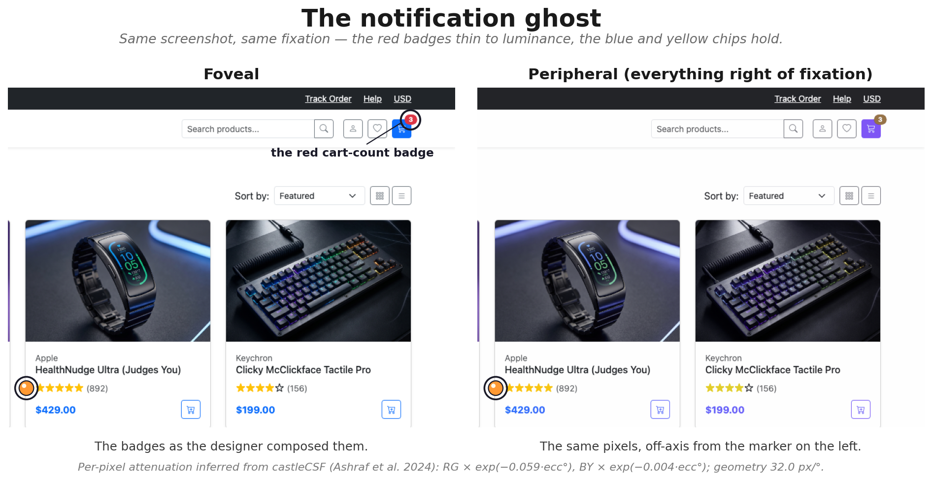
To make those degrees concrete: at a typical desktop setup — a 24-inch monitor at about 60 cm — the full screen subtends on the order of tens of degrees horizontally. Fixate the middle of a paragraph and a nav bar, tab strip, notification tray, or corner badge can easily sit 8–20° away — squarely in the zone where red-green chromatic resolution is already substantially weakened.
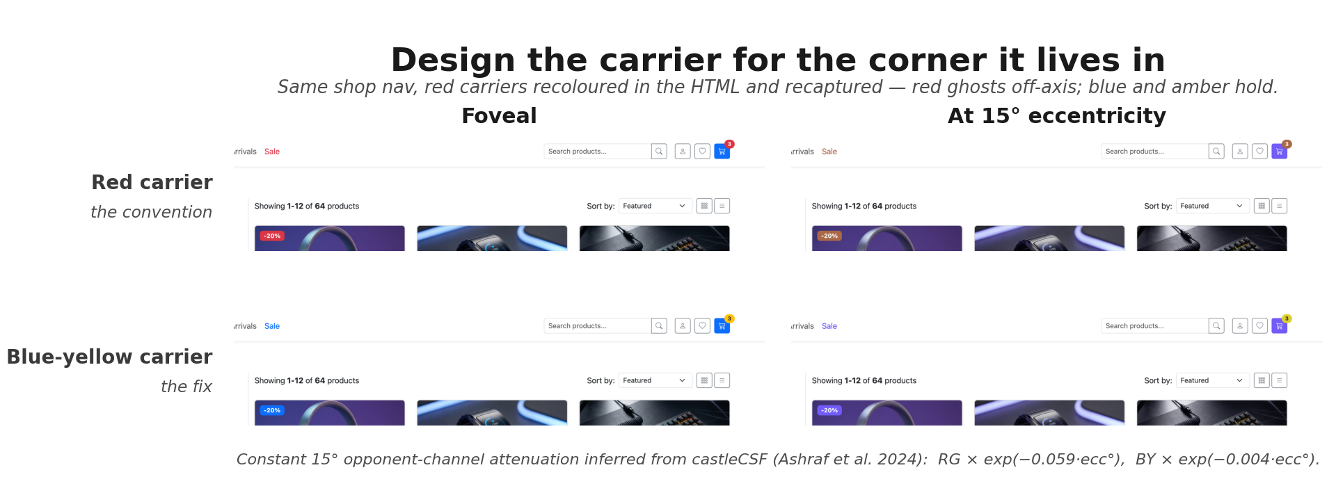
The practical consequence is about colour identity, not detection. A bright red badge at 15° eccentricity may stay perfectly detectable on luminance contrast — you see something in the nav bar — while its specifically red identity becomes unreliable. A blue badge of matched size and luminance retains its chromatic identity further out, on the more eccentricity-tolerant blue-yellow channel. Detection, localization, colour-naming, and semantic interpretation are separable: the asymmetry bites hardest on naming and on hue-only carriers, less on signals backed by luminance, size, shape, motion, or position. The familiar cart-icon-with-bubble pattern works for exactly this reason — what your peripheral vision picks up is the shape change (icon → icon-plus-appendage), not the red. The red carries semantic recognition once you foveate; the shape carries which-icon-changed before you do.
EXIT signs: the live debate
US building codes (NFPA 101 / IBC) don't mandate a colour for EXIT signs — just "distinctive in colour." Some jurisdictions require green; many default to traditional red. The international standard (ISO 7010) chose green-on-white running-man.
In a fire evacuation, your fovea is on the path ahead, not the sign. The sign sits at 15–30° eccentricity. At those distances a red sign's chromatic identity becomes much less reliable than its luminance contrast with the wall; a green or yellow-green sign typically has both higher luminance and a chromatic carrier on a more eccentricity-tolerant axis. That gives the green/yellow-green case a plausible perceptual advantage as a testable hypothesis — matched for size, luminance, smoke, illumination, and placement. Real evacuation performance still has to be measured; familiarity, mounting, and lighting may dominate. The peripheral colour science doesn't currently enter the standards conversation at all.
Signs already did the work
The FHWA exploited something in this neighborhood when they moved school zone signs from standard yellow to fluorescent yellow-green. The stated rationale was "detection distance" and "conspicuity" — not cone opponency. Conspicuity gains there are multi-causal (high luminance, high saturation, retroreflective/fluorescent materials, contrast against natural backgrounds), so any contribution from the more eccentricity-tolerant blue-yellow mechanisms is one component, not the whole story. But the direction of travel is consistent with the channel asymmetry.
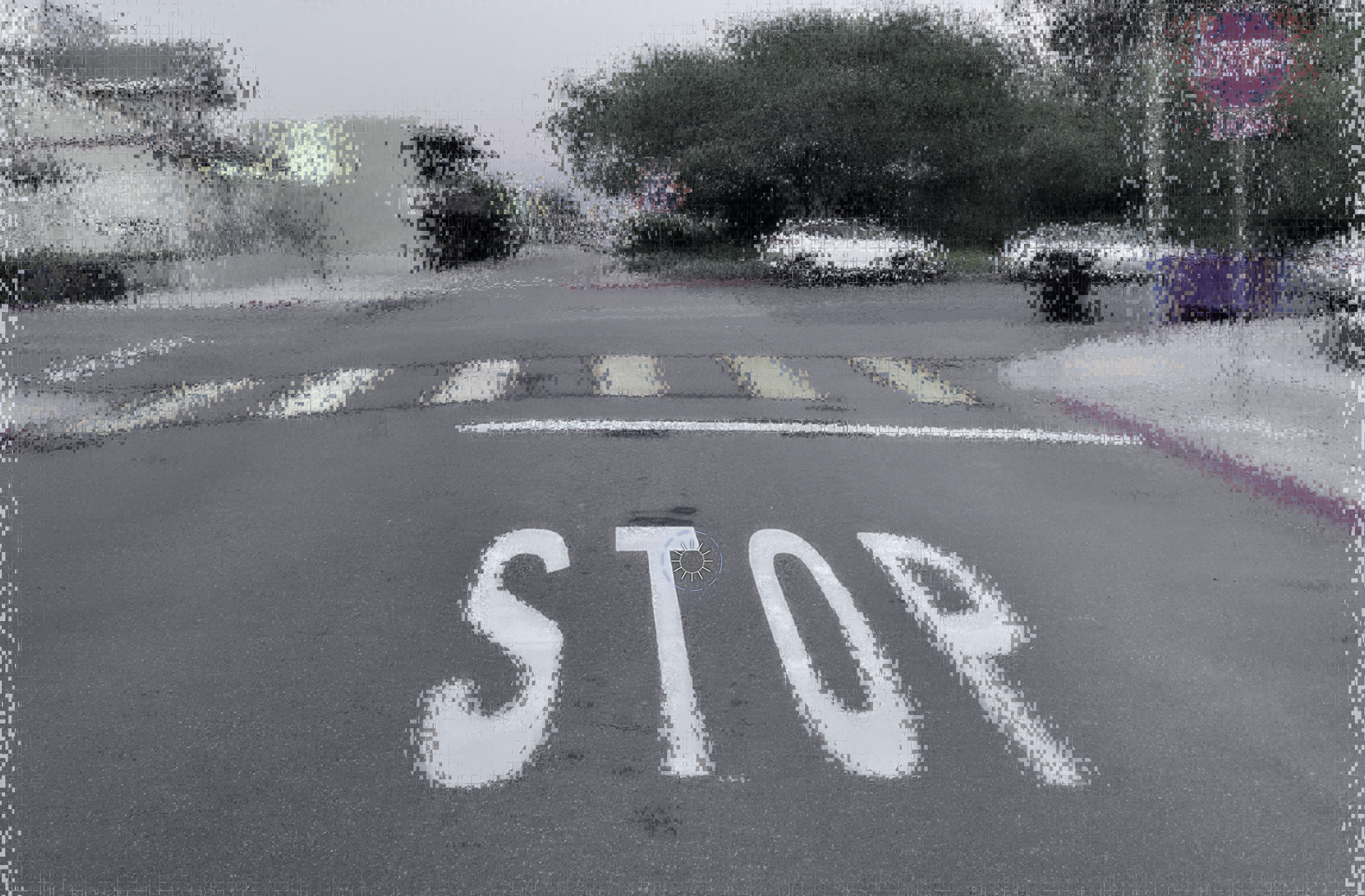
The pattern shows up across the whole MUTCD road-sign palette when you read it that way: red (STOP, YIELD) for signs that demand foveal fixation, where L-M runs at full strength; yellow for transitional warnings noticed peripherally and foveated to read; green for guide signs scanned at higher luminance; and blue (SERVICES) for ambient peripheral awareness — gas, food, hospital, the things you want to detect far off-axis without breaking your forward gaze. The hierarchy was assembled empirically and the MUTCD doesn't cite cone opponency, but the gradient is at least compatible with the eccentricity story. Stop signs are foveal signals — the octagon carries peripheral detection (shape survives eccentricity better than colour), red handles urgency once you're already looking. EXIT signs are the opposite case — detected peripherally while moving — which is why the chromatic-channel argument lands so differently for each.
Physical signage took a century of iteration to converge here, and it converged through redundancy: shape and colour and luminance and placement all carrying part of the load. Screens are younger and haven't had that century yet.
What this means for screen design
A red badge in your nav bar isn't doing the job you think it's doing — not because red failed, but because the part of red that recruits attention from the periphery isn't the hue.
The convention that red = urgent is miscalibrated for peripheral visibility. Red works at the fovea, once you're already looking directly at it, because L-M opponency runs at full strength only in the densely-packed central retina. A notification's whole job is to recruit your attention before you're looking at it — from the periphery, where the colour has already faded.
Luke Wroblewski's form-design guidance already has the synthesis: red so the user reads "error" the moment they look, plus icon, label, inline message, position next to the field. The peripheral-color story is why every cue except the hue is non-negotiable — red carries the semantic recognition once the user looks; everything else carries which field to look at.
The gap in the standards
Open the major guideline documents and search for the chromatic asymmetry: it isn't there. WCAG specifies foveal text contrast thresholds and warns about red-green colour blindness for the ~8% who have it; it says nothing about the chromatic decay that affects 100% of viewers everywhere except the central 2°. Material Design teaches token systems and accessible contrast pairs. Apple's HIG engages vision science more than the others — the visionOS section reasons about gaze targeting at the shape level — but never crosses from references to gaze and field-of-view into a per-colour rule like "if a status indicator sits beyond 10° of likely fixation, prefer the blue-yellow channel." That rule could be tested and prototyped; the science is sufficient.
Why design education hasn't caught up
Design schools teach colour the way Albers and Itten taught it — hue, saturation, value, simultaneous contrast, complementary pairings, perceptual mixing. Beautiful, foundational, silent on cone biology. You can earn a design degree without ever encountering "L-M opponency" or "S-cone bipolar wiring," because design still largely lives in art schools (RISD, Parsons, SVA, ArtCenter) and vision science mostly lives in psychology departments and human-factors labs (Wisconsin, NYU, MIT BCS). Different journals, different conferences, different career tracks. The fields don't share readers. A finding that's been textbook for 25 years in vision science can be entirely novel to a working designer, even a senior one. The structural problem is geometric too: web designers compose components inside viewport-bounded rectangles reviewed at the fovea on a Figma canvas, and chromatic-stability-across-eccentricity is a property the rectangle can't reward.
AR/HUD makes this urgent
Screens at least sit in front of you, where you can foveate the bits you care about. Augmented reality (AR) and head-up displays don't. A status indicator in an AR overlay sits at 15–30° eccentricity by design — that's the whole point. A small red urgency indicator in that zone is, by the math above, at risk of becoming mostly a luminance dot. The same goes for cockpits, driver-assist HUDs, surgical mixed-reality, and ambient smart-home displays — anywhere the fovea is meant to stay on a primary task while alerts arrive in the periphery.
Aviation HUD doctrine arrived at a compatible answer for different reasons — task-priority logic, not cone biology. Red is reserved for warnings that demand foveation, paired with flashing, audio, and central placement (SAE ARP4032/4102, FAA AC 25-11). The redundancy is what makes the "red = warning" convention survive the periphery. Modern AR overlays putting hue-only red status icons in the periphery without flashing or shape redundancy are a regression from a design tradition that already converged on the right answer for adjacent reasons.
The gap is closing
The cone mosaic has a strong central peak for red-green and a wide-field plateau for blue-yellow. Modern UI conventions — red-for-error, blue-for-info, urgent-things-glow-red — were assembled at the centre. Most of the time the user isn't there. The convention was written where the cones are dense; the user is looking from where they aren't.
The future is already here — it's just not evenly distributed. Some shops absorbed the cone-opponency science years ago: Apple has had vision scientists on display teams for decades (Andrew Watson, formerly of NASA Ames's Vision Group, is Apple's Chief Vision Scientist). AR/VR foveated rendering exploits the chromatic asymmetry as a perf/power lever — recent work drops high-frequency red-green light off-axis to save display power, because the eye can't resolve it anyway.
Most design tooling didn't get the memo. Doug Bowman's 2009 "Goodbye, Google" essay is the famous artifact: designer intuition vs A/B-tested data, with the eye nowhere in either argument.
What might be changing now is the cross-disciplinary plumbing. The gap stayed open because vision science, HCI, and design didn't share readers — Livingstone's framing was delivered to HCI's flagship venue in 2012 and still didn't migrate into design tooling. AI tools at least offer a different shape: a designer asking about a red error state can be pulled into the cone-opponency literature in a single conversation. Whether that actually moves findings from Vision Research into design tooling is a separate empirical question. This post is one experiment in that direction.
The fix isn't to abandon red — red still does extraordinary foveal work, and luminance + shape + motion + position carry it most of the rest of the way. Red is not wrong; red-alone-at-eccentricity is wrong. The fix is to audit for the visual field, not the rectangle: saturation, size, and shape redundancy on off-axis alerts; blue-yellow as the chromatic carrier when colour itself is doing the work; a peripheral simulator in the loop.
The deeper question — what palette of N hues is most discriminable in the periphery — is open territory; the standard categorical palettes (ColorBrewer, Wong, IBM, Tol) are all tuned for foveal reading, and nobody has published the peripheral-categorical experiment. As a working hypothesis, not a result: 2 splits probably ride cleanly on the blue/yellow axis (both surviving opponent dimensions); 3 splits add luminance as the third channel; 4+ runs out of hue fast, and the design has to add shape, position, or motion as parallel carriers. Real psychophysical work on this would be welcome.
Read more
Painters and peripheral vision
- Margaret Livingstone Lab — Vision and Art: the lab page with the canonical Mona Lisa decomposition and Livingstone's broader work on art and the visual system.
- Livingstone, M. (2002). Vision and Art: The Biology of Seeing. Harry N. Abrams / Harvard. The book-length version — the sfumato chapter and the Renaissance-painters analysis are the primary reference for the spatial-frequency argument.
- Livingstone, M. S. (2000). "Is It Warm? Is It Real? Or Just Low Spatial Frequency?" Science, 290(5495), 1299. The Mona Lisa smile-as-spatial-frequency claim in its original published form.
- Livingstone, M. (2012). Vision and Art — UIST 2012 keynote. The chromatic-channel framing delivered to the HCI community at its flagship venue. The canonical "HCI had the moment and didn't bite" data point.
- "Is luminance the true reality?" — pixelcraft.photo.blog. A designer-side companion to the Picasso/Livingstone framing, using Van Gogh's Green Wheat Field with Cypress as a colour vs luminance comparison; strong on textures and what colour adds back when luminance already carries the structure.
Cone opponency and the eccentricity gradient
- Mullen, K. T., & Kingdom, F. A. A. (2002). "Differential distributions of red–green and blue–yellow cone opponency across the visual field." Visual Neuroscience, 19(1), 109–118. The canonical psychophysical mapping of the L-M / S-(L+M) eccentricity asymmetry.
- Ashraf, M., et al. (2024). castleCSF: a unified contrast sensitivity function across luminance, chromatic direction, eccentricity, area, spatial and temporal frequency. Journal of Vision, 24(4):12. The contemporary CSF model the per-pixel attenuation in this essay's figures is inferred from.
- Calkins, D. J. (2001). "Seeing with S cones." Progress in Retinal and Eye Research, 20(3), 255–287. The retinal-circuit story behind why S-cone signals survive across the retina.
- Duinkharjav, B., et al. (2022). "Color-perception-guided display power reduction for virtual reality." ACM Transactions on Graphics (SIGGRAPH Asia). Foveated rendering extended to per-channel chromatic detail — drops high-frequency red-green light off-axis where the eye can't resolve it. The chromatic asymmetry exploited as a graphics-pipeline feature.
- Watson, A. B., Barlow, H. B., & Robson, J. G. (1983). "What does the eye see best?" Nature, 302, 419–422. The classic detection paper that pinpointed the visual system's most efficient spatiotemporal stimulus — a small ~7 c/deg patch drifting at ~4 Hz — and grounded a generation of contrast sensitivity work.
Apple, design systems, and form-design empiricism
- Apple Human Interface Guidelines — Designing for visionOS. The section that engages with field of view, gaze targeting, and shape affordances; see also the Color section.
- Watson, A. B. (2014). "A formula for human retinal ganglion cell receptive field density as a function of visual field location." Journal of Vision, 14(7):15. See also Watson's Google Scholar profile for the full body of work on display psychophysics.
- Wroblewski, L. "Inline Validation in Web Forms." Lukew.com. The form-design pattern source for the multi-cue principle: never rely on hue alone.
- Wroblewski, L. (2008). Web Form Design: Filling in the Blanks. Rosenfeld Media. Book-length treatment of error states and redundant cueing.
Standards referenced
- FHWA Manual on Uniform Traffic Control Devices (MUTCD) — the US road-sign colour hierarchy.
- NFPA 101 Life Safety Code and IBC — the EXIT-sign building-code conversation.
- ISO 7010 — the international safety-sign standard (green running-man).
- WCAG — foveal contrast thresholds.
- FAA Advisory Circular 25-11 — Electronic Flight Deck Displays. The canonical cockpit colour-coding doctrine: red for warnings, amber for cautions, paired with audio and central placement.
- SAE ARP4032 · ARP4102 — cockpit colour and human-factors recommended practices.
Tools
- Scrutinizer browser — downloadable peripheral-vision simulator that ran the per-pixel passes in this post.
- Scrutinizer Pro for Figma — the same simulator running on your design frames.